
Wearable devices continue to attract consumers’ attention and perhaps even more so after the Apple Watch went on sale April 24. However, reported production delays have limited deliveries to some customers. The recent availability of Apple watches has enabled both consumers and analysts to assess the usability and user experience of Apple’s smartwatch product.

Raluca Budiu of the http://www.nngroup.com/ (NN/g), a well-known firm offering “Evidence-based user experience research, training and consulting”, has delivered an appraisal of the Apple Watch user experience. In the summary to her article, the NN/g analyst states, “Smartwatch apps should rely on gestures more than on navigation elements, prioritize the essential, support handoff and create tailored, standalone content”.
Dr. Budiu first critiques the very small graphical user interface (GUI) targets employed in the Apple Watch. For example, Dr. Budiu points out that the app selection screen of the Apple watch uses a focus-and-context visualization (see illustration below). However, the largest icons are too small to launch accurately and deleting an app requires the user to press the small “x” icons pictured below that are only about 2 mm in diameter.
 Source: Nielsen Norman Group
Owing to the dimensions of the human finger, usability professionals routinely recommend that touch user interface (UI) target size be nominally 1 cm x 1cm. Dr. Budiu makes the point that the Apple watch touch display size is only about 32 mm by 35 mm, which could certainly lead a designer to employ very small touch targets. However, she goes on to suggest that there are two alternative UI modalities, voice and gesture, that can save display screen real estate while allowing users to navigate around an app, the device, or to input information.
As an example of the use of gestures in the Apple watch, Dr. Budiu notes that the watch introduces the use of “force touch”. The illustration below shows how a force touch registers a user input to change the nature of the displayed information. Since the force touch input mechanism is attached to the whole screen, not to a particular GUI element displayed on the screen, it doesn’t matter precisely where the user’s finger touches down to initiate a force touch gesture, thus solving the “fat finger” problem.
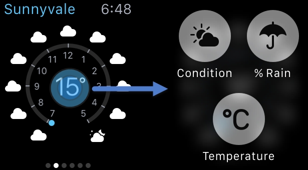 Source: Nielsen Norman Group
Dr. Budiu identifies the Apple watch’s use of a “deck of cards” type interface as one that works well on the watch while being a UI approach that is not optimum for other device types with larger displays.
While the findings of the user experience analysis conducted by the Nielsen Norman Group is more extensive than I can discuss in this article, their appraisal of the Apple Watch user experience is a good example of the user considerations that will vitally determine the success of wearable consumer electronic products. – Phil Wright