A couple of weeks ago, I wrote about a new way of charting the performance of displays using gamut rings. This week, I was able to catch up with display guru Brian Berkeley (along with Jeff Yurek of Nanosys), to get more information on the technique and now I’m even more convinced!

I have known Brian for many years from his time with Apple, Samsung and his time as President of the SID.
I would suggest a quick review of my previous article as it was recent (You Can’t Describe Colour Volume in 2D. Or Can You?). The key point is that colour is 3D. That was formally clarified by the CIE in CIE168 in 1976. However, the standard way of presenting colour performance in the display industry is using 2D CIE colour gamut charts. Berkeley highlighted that those, like him, working on finalising the next version of the ICDM standard on display measurement and specifications, now refer to these charts as ‘chromaticity charts’ as they do give some sense of the capability of the display, but can’t give a sense of what happens at different luminance levels.
How did these charts ever come to be universally used to specify colour performance, then? Well, it’s because until around 2000, most displays were additive with separate RGB channels (and most of them were CRTs which are straightforwardly additive). When the displays are RGB and additive, the traditional CIE charts are a pretty good approximation to the 3D performance, so were useful and relatively simple.
Since then, there have been a range of multi-primary, or more accurately, multi-chromatic colour. These include RGBW, RGBY and other variations and are based on lasers, projectors and a range of flat panel technologies. In these multi-chromatic displays, the colour volume does not necessarily match the chromaticity chart – a problem that the gamut rings I wrote about in my last article.
Better Measurement
The first attempts to deal with this topic were included in the first version of the ICDM standard (freely available for download here https://sid.org/Publications/ICDM.aspx#7327483-idms-download ) which included the measurement of Colour Light Output (section 5.4) and Sampled Flux from Color-signal White (section 15.4). I wrote about CLO five years ago. https://www.displaydaily.com/article/display-daily/is-there-a-new-number-for-projector-performance What I had not heard, until recently, was that a certain large company (or companies), with a lot of expensive lawyers, tried hard to kill the metric and came close to stopping the publication of the IDMS standard. The SID didn’t have the resources for a long and expensive legal fight. However, in the end, SID stood up to the bullying and it was published.
Anyway, back to the technology. Measuring the colour volume, rather than the simple CIE chromaticity triangle gives very different results compared to using the colour volume. Berkeley shared a presentation created by Johan Bergquist, containing material previously published in the Journal of the SID and at SPIE. Bergquist was also one of the authors of the Information Display article about gamut rings. (The gamut rings are also known as Masaoka rings, as they were developed by Dr. Kenichiro Masaoka of NHK).
The presentation compared two different laser projectors. One uses a single modulator while the other has three channels. When you compare the coverage of the BT2020 colour gamut, using a CIE 1931 chromaticity chart, the projectors are not far off identical. As a buyer using this kind of chart for checking the specification, you would think that they are very similar. (I re-arranged these charts to make it easier to compare).
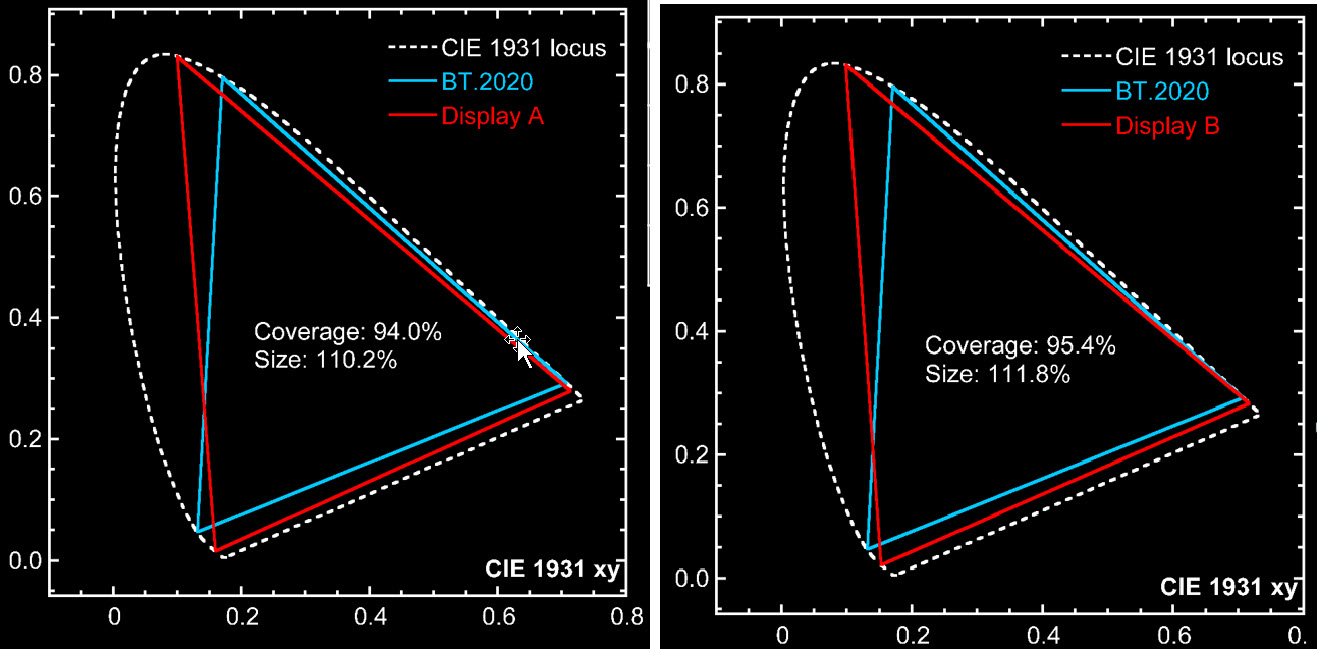 Using a CIE Comparison, the two displays are very similar. Click for higher resolution.
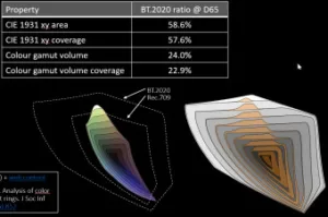
However, if you compare the colour volume, you get a very different result. The first two figures for each display are based on the area above. The second two figures are the volume figures.
| Property | Display A BT2020 @ D65 | Display B BT2020 @ D65 |
| CIE 1931 xy area | 110.2% | 111.2% |
| CIE 1931 xy coverage | 94.0% | 95.4% |
| Colour gamut volume | 55.6% | 111.8% |
| Colour gamut volume coverage | 51.5% | 92.5% |
The colour gamut rings show a very clear comparison of the two displays. Now, they don’t look the same.
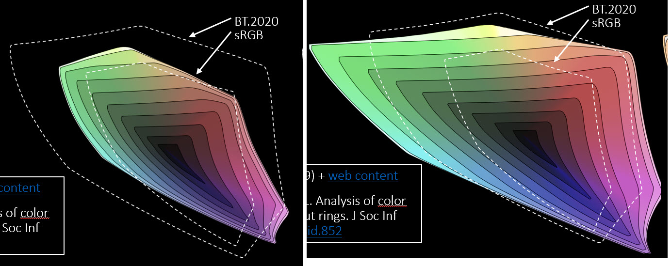 Gamut ring comparison. Click for higher resolution
While Display A can’t even cover the whole of the SRGB colour volume, Display B gets close to the 2020 reference and completely covers sRGB (it would have been interesting to see the P3 reference!)
Now, the next thing I learned on the call is that there is a second version of the gamut rings chart. That’s a comparison between the rings of the display under test versus a reference plot of the gamut. That shows exactly where any deficiencies are. The grey areas are parts of the reference volume where the display has no output. Again, this chart shows exactly where the displays differ.
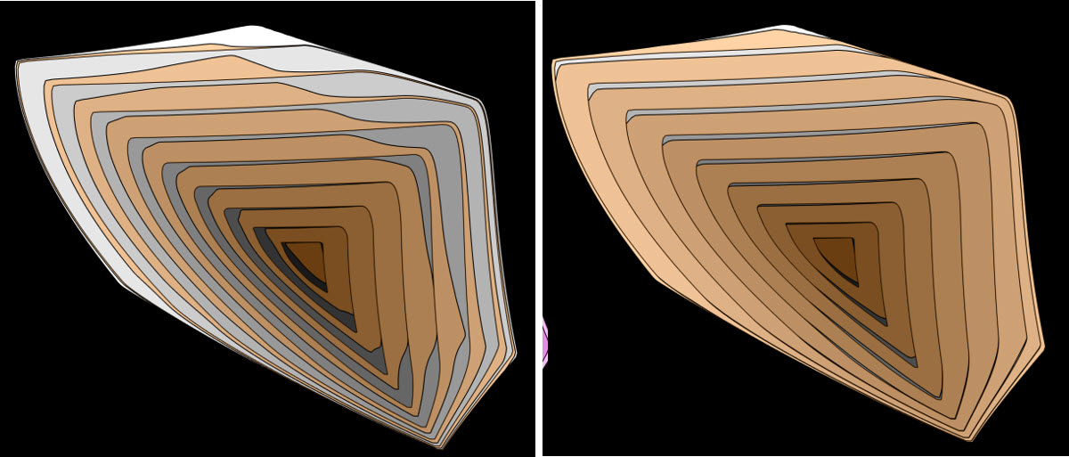 Volume variance from the gamut reference. Click for higher resolution.
In his presentation, Bergquist also showed the plots from a single modulator blue laser + phosphor projector, shown below. The coverage of the display volume is 60% less than the coverage by area.
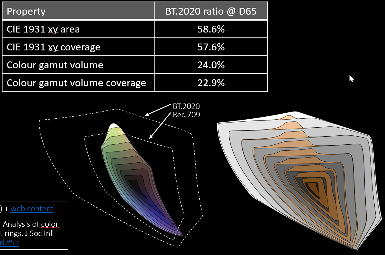 Display C is a long way short of the colour volume of Rec. 709. Click for higher resolution.
Finally, we discussed the topic of how you make a measurement. Berkeley admitted that the IDMS 5.31 VCRC* didn’t work well as there were not really enough measurement points and it assumed that the colours were additive. On that basis, the method should probably be deprecated in the new standard. One of the challenges of the new colour gamut rings is that a lot of measurements are needed, especially for Rec 2020 gamuts. It really is not realistic to make the measurements manually, so there needs to be support by companies that make display measurement systems to develop automated routines to allow the creation of the rings. (BR)
(As a declaration of interest, Berkeley told me that he has been working as a consultant with Nanosys on this topic. Clearly, Nanosys has a real interest in this topic as LCDs using its QD technology will have much better colour volume than OLEDs from LG based on RGBW. Now, that poses the question of whether QLED or OLED is better? The reality is that it depends what you want. I support the measurement system, and the potential weakness of RGBW, as implemented in most TVs, but I still chose an OLED for my TV as I wanted the better blacks and was prepared to sacrifice some saturation in highlights. The point about the better measurement system is that it allows informed decisions.)
(* Note in the last paragraph, I initially reported that IDMS 15.4 luminous flux. That was a mistake in my notes of our talk. 15.4 is fine, it was 5.31 VCRC or Volume Colour Reproduction Capability that doesn’t work so well.)
Thanks to Nanosys Inc for sponsoring the release of this article from behind the Display Daily paywall. The article will not count towards the ‘free article count’ for registered users. If you or your company would like to move an article outside the paywall, please contact us.